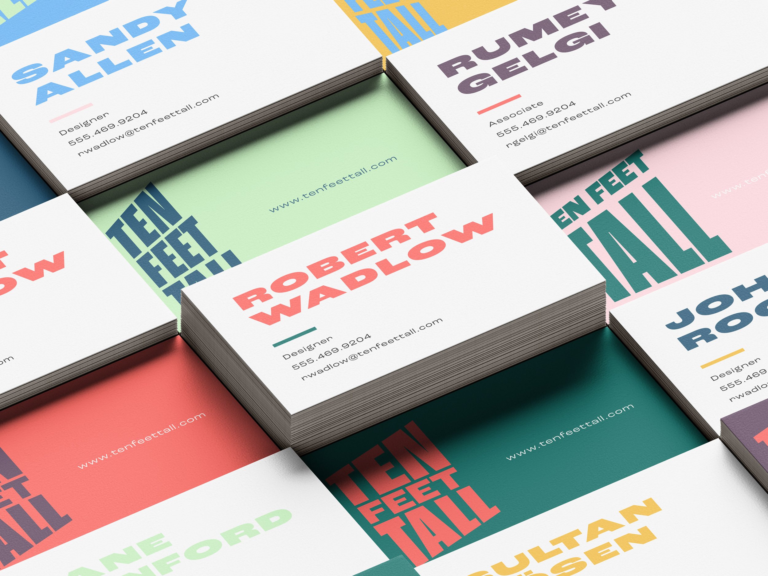
A logo is often times the very first contact a person has with a brand. It needs to represent everything that brand stands for but doing it in the simplest form possible. I think of this as one of the greatest challenges in design which makes it that much more rewarding of a process. Here is a collection of the marks I have created thus far.
The Marbel electric skateboard has a companion app that lets the rider tweak and customize their board settings, contact support, see their range left on the board, and even control the throttle and braking.
All of these settings and features needed to be as simple and intuitive to use as possible and be functional for their specific use case such as quickly changing the top speed or braking quickly while riding in the street.
The ZBoard is the world's first, weight-sensing electric skateboard. For their newest top-of-the-line board they aimed to conquer the infamous hills of San Francisco with the San Francisco Special. The color palette is borrowed from the local favorite San Francisco Giants and features an abstracted skyline featuring the Golden Gate Bridge, Transamerica Pyramid, Coit Tower, Palace of Fine Arts, San Francisco Bay, and of course its hills. Learn more at www.zboardshop.com.
Branding a rolling work of art.
Previously named Burnt Hills Longboards based on their hometown of Burnt Hills, NY, Latitude Longboards sought to create a sophisticated brand of longboards for riders of all ages.
Competitive Report
The first thing the company needed was a clear understanding of their competitive set. An audit was done for all major competing longboarding companies encompassing logos, websites, board styles, color palettes, and key messaging points.
Metaphor Elicitation Research
Using the technique of Metaphor Elicitation, an image library of non-literal images was created along with a set of targeted questions to help the founders put into words what their brand stood for. This also helped in the creation of their positioning statement.
Positioning Statement
Using the qualitative research done in the previous phase we set up a collaborative workshop with the client to craft and finesse a working positioning statement for the brand moving forward. A set of brand attributes was also created to help judge future creative work for the brand.
Naming
From the research it was clear that the original Burnt Hills Longboards name was not the right fit for the brand. A list of over 500 names was created, boiled down to 15 finalists, and the name Latitude Longboards was selected.
Logo Exploration
A set of six logos was presented to the client revolving around the brand attributes and positioning statement. After this, a final round of revisions was completed to find the perfect color, symbol, and typeface combination.
Final Logo
The final logo, set in a confident all caps DIN Black, uses a bright green color palette to connect to nature and the feeling of freedom and rejuvenation riders often feel. The diagonal lines can be seen as latitudinal lines or hills of different gradations. The circle is also used in the symbol as it connects to the silhouette of the Earth in which the latitudinal lines cut across. The circle is also a common shape in longboarding, relating to the wheels, bearings, and bolts that are fundamental to every board's construction.
Deliverables:
- Metaphor Elicitation research
- Competitive Audit
- Brand Attribute Creation
- Positioning Statement
- Name
- Logo
- Logo Application
- Color Palette
Bison is a new start-up player in the alternative investments market in Boston.
Deliverables:
- Logo
- Color Palette
- Image Library
- Collateral Design
- Website
- Business Card
- Presentation Folder
- PowerPoint Template Design
As creative director and designer, a full fledged advertising campaign was created to launch Saint Vincent's brand new Cancer and Wellness Center in the heart of Worcester.
Traditional hospital advertising clichés of smiling doctors and patients were carefully avoided to create a campaign described as poetry in motion. To show Saint Vincent's true emphasis on local care and caring hands were used as a metaphor for their compassion. The use of slow motion and black and white in the TV commercial were chosen to emphasize and dramatize every-day motions and gestures to drive that sense of compassion home. To tie the campaign back to Worcester each doctor showcases one unique fact that demonstrates his or her commitment to caring in the community.
The campaign carries into billboards, Commuter Rail posters, bus sides, magazine, newspaper, online banner ads, outdoor banner ads, and more. The use of hands is consistently applied with smart headlines that emphasize their main messaging point of caring.
Find out more at www.svhcares.com
Branding that sticks.
Previously named Maple Reserve Co., Tonewood was aiming to break away from traditional conventions of glass maple leaf bottles and plastic jugs that riddle the competitive landscape. In its place a sophisticated design aesthetic and tone was to be created.
Naming
The first step in shedding this long road of woodsy design language was changing the name while not removing it too far from the Vermont heritage where it came. A list of over two hundred names was created and in the end Tonewood was chosen. A tonewood is any wood used in the production of musical instruments, maple being a very common wood used. This subtly compares the quality of the syrup to the craftsmanship of a fine violin while still connecting back to the trees which produce it.
Logo Exploration
A set of six logos were presented to the client with the new name and focus on clean and sophisticated design. After this a small round of revisions was completed to find the perfect color, symbol, and typeface combination.
Final Logo
The final logo shows a simple drop of syrup split into four quadrants of varying redish orange colors. These four quadrants represent the four grades of syrup produced throughout a season. The typography is set in Gotham to let the symbol stand as the hero in the mark. A vertical orientation was also created for use on bottles and jars where horizontal space is limited.
Packaging
A series of packaging ranging from syrups, to creams, to candy wafers was created with a consistent visual language that broke away from the current standard of the maple syrup category. Tall minimalist glass bottles were chosen to show the rich color changes in the unique grades of syrup and a dark grey was used to contrast those bright colors and make them pop even more.
E-Commerce Website
Primarily selling products online, an e-commerce website was created to promote and sell their products to the largest audience possible. Additional logos were created to represent the different sugarbushes in Vermont where the syrup is created.
Deliverables:
- Name
- Logo
- Packaging
- Collateral Design
- E-Commerce Website
- Color Palette
Thorn Tea is a Connecticut based company which carries ancient and modified teas for leisurely enjoyment and medicinal need.
To mirror this dedication to the natural and ancient art of tea consumption an equally ancient and unique identity was created. The skull and rose was concepted and illustrated by owner and founder Erik Peterson. The illustration was then redrawn and refined into something acceptable for logo use. The custom hand drawn typography based on Utopia was then created to accompany the rugged and earthy look and feel of the symbol.
Find out more about Thorn Tea at www.facebook.com/thorntea
Creating a new letter.
Integration Partners is a leading, full-service voice and data network engineering firm serving enterprises. The logo plays off of the word integration by literally integrating the two words of the name together through a new ligature. The ligature was then refined in many different typefaces, styles, and effects to ensure its readability.
Deliverables:
- Brand Audit
- Logo
- Brochure Design
The Real Man's Meat™
The design and branding of tofu packaging has been a widely neglected area in the food industry. In this project I set out to give a unique and interesting spin on tofu. Injecting humor into the brand it plays off of the perception of meat being a manly thing in our lives that vegetarians are missing out on. With Manly Tofu you can throw a tofu t-bone on to the grill with the steak of your non-vegetarian friends.
Deliverables:
- Name
- Logo
- Packaging
- Stationery Design
- Website
- Color Palette
- Tagline
While working at Protobrand I oversaw all brand communication and design to ensure a consistent brand image. Typefaces, color palettes, and layouts were all carefully created to promote that image. I also managed junior designers to ensure deadlines were met and the work was on strategy for their respective clients. Videos and brochures were developed for our major product lines and capabilities presentations were created for business development efforts.
When moving to a new office I helped in a complete redesign of the interior choosing colors, art, materials, kitchen layout, furniture, and layout of workspaces even down to the door handles, door stops, and acoustic panels.
Interactive Brochure
COME TO THIS.
Described as an intelligent conference on the persuasion of advertising and design this is basically an advertising campaign for a conference of ad campaigns. A tongue and cheek concept of advertisings persuasive and often mind changing tendencies was used represented by a hypnotist's spiral. Overlaid on these spirals are demands from the advertisement in a transparent font to represent advertisings hidden motives. A subway user would be demanded to tap the screen to add money to their card, to "come inside" when the train pulls up to the station, "come to this", or "go here" when seeing the ads in the train. A series of print ads was also created that has pop out glasses that you can construct to get 5 dollars off admission when wearing them to the conference. The idea being that other travelers would see all of the attendees proceeding to the conference as if in a trance because of their glasses. Online advertisements such as email blasts, youtube, and facebook ads were also created. Finally event swag also carried on the same theme.
Deliverables:
- Name
- Logo
- Subway Advertising
- Magazine Advertising
- Direct Mailer
- Email Advertising
- Web Banner Advertising
- Website
- Conference Swag Design
Thinking through the box.
Perimeter is a package design firm that builds market ready solutions that focus on ever improving the ease of use of the products that they hold.
Deliverables:
- Logo
- Icon System
- Trade Dress Creation
- Brochure Cover Design
- Website Direction
- Stationery System
- Business Card Design
- Color Palette
Results may vary.
The Designer's Survival Kit is a fun package design assignment for designers. Included is five essential graphic design books, a Moleskine™ notebook, X-acto™ blade with four extra blades, mechanical pencil, caffeine, black thick rimmed glasses, a copy of the Helvetica documentary, and a black turtle neck adapter that converts normal black t-shirts into the iconic turtle neck.
Black Duck is dedicated to helping their customers increase their strategic use of open source, while simultaneously strengthening and collaborating with the greater community.
Deliverables:
- Brand Audit
- Brand Architecture
- Logo
- Set of Community Logo
- Duck "Mascot" Refinement
- White Paper / Case Study Template Design
- Website
- Powerpoint Template Design
- Business Card
- Brand Guideline
- Color Palette
- Image Library
The original cover, designed by the very talented Rodrigo Corral, falls flat of truly capturing what it is like to think like a great graphic designer. The visual of push pins on a crit wall gets the point across but greater opportunity existed to push this cover even further conceptually.
In the redesigned book cover of Debbie Millman's How To Think Like A Great Graphic Designer, I illustrated a designer's need to problem solve using a die cut cover that entices the viewer to solve the mystery of the book's title. Each underscore has a color that associates to one of the letters on the cover spelling out the answer to those who are looking. The answer is then revealed when the viewer opens the cover. The cover forces you to think only to find out the answer is to think in the end.